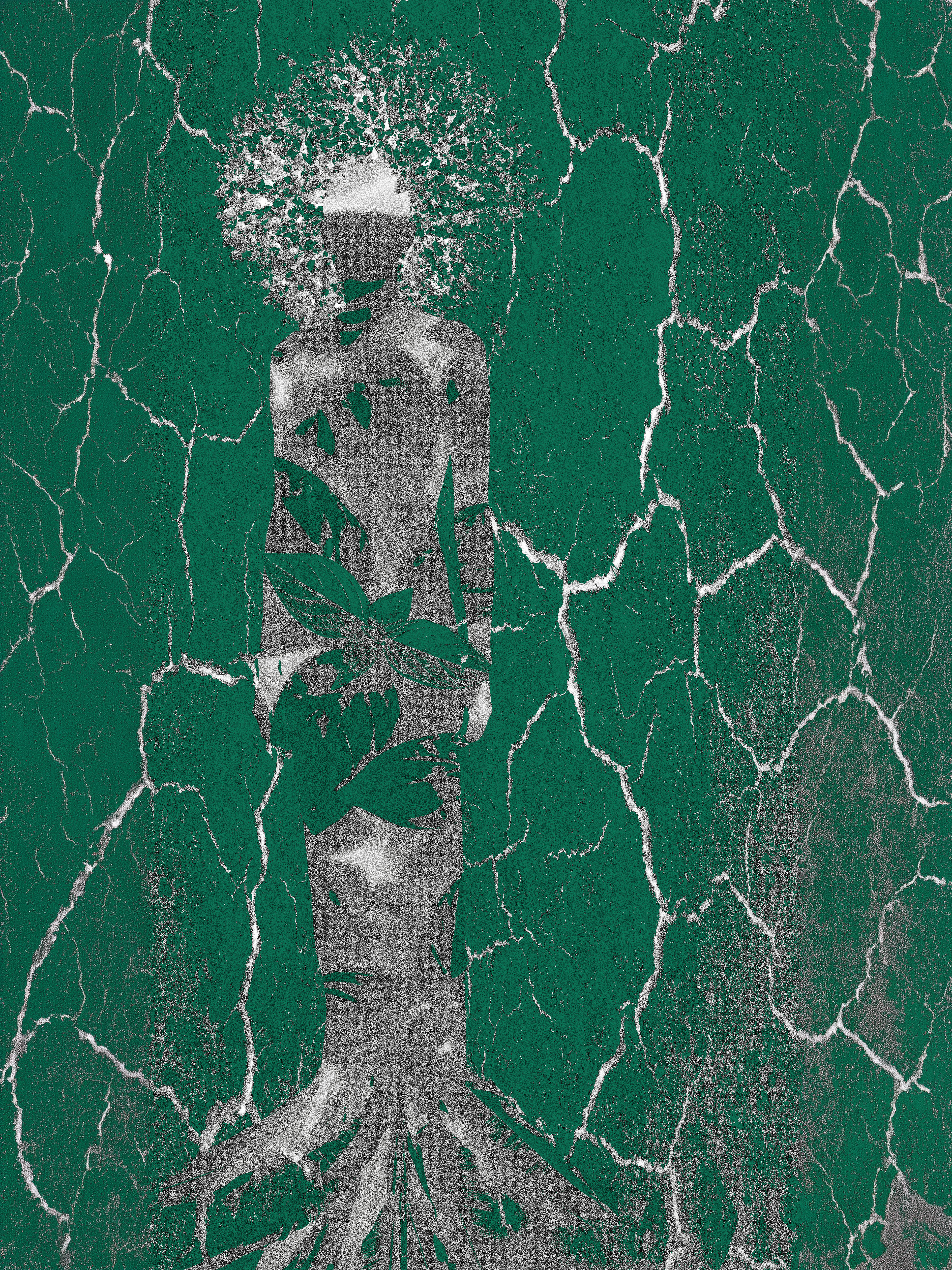
Byron Basson, Connected. Digital media. 18 x 24 inches. Central University of Technology, Free State, South Africa, 2026
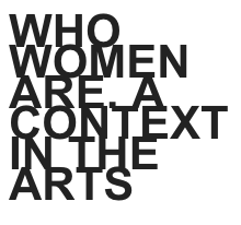
Project Statement
This new design poster shows the relationship between the female body and the land, with it deeply imbedded. The cracks also indicate the lasting effects of colonialism and exploitation. The purple shows the bodice is deeply rooted into the land, that also indicates itself as dry land. This indicates that the bodies of woman and the land are sources of life, growth and resilience.
The cracked surface surrounding the surface symbolizes the environmental damage and historical damage to both land and women. The leaves also suggest potential for renewal. I used purple to Reference International Women’s Day, symbolizing dignity, justice and empowerment. With the colour purple onto the body, they connect their struggle to global movements and equality.
The design works with themes of bodies of colour and geographies of form, where the body had become a like landscape shaped by social, political and environmental forces. I intended to emphasize identity like something formed through connection of place, history and lived experience.
The phrase Sissi ni Sawa emphasizes the solidarity of Latin women, Black women and African women, acknowledging both share struggle and strength. This design’s purpose is to cross geographical boundaries.
Self reflection
For my first design I planned to design a typographic poster. The design would have featured words or stereotypes on a silhouette of a women. The problem with this idea, is that the crouching position portrayed women as weak. Therefor I decided to go for an upright figure and also have more focus on the topic Bodies of colour, Geographies of form.
I really enjoyed hearing about and working with other people from around the world. This was just the beginning of what it could be like to work across borders. Looking back I feel like I could have learned even more and I’m looking forward too.
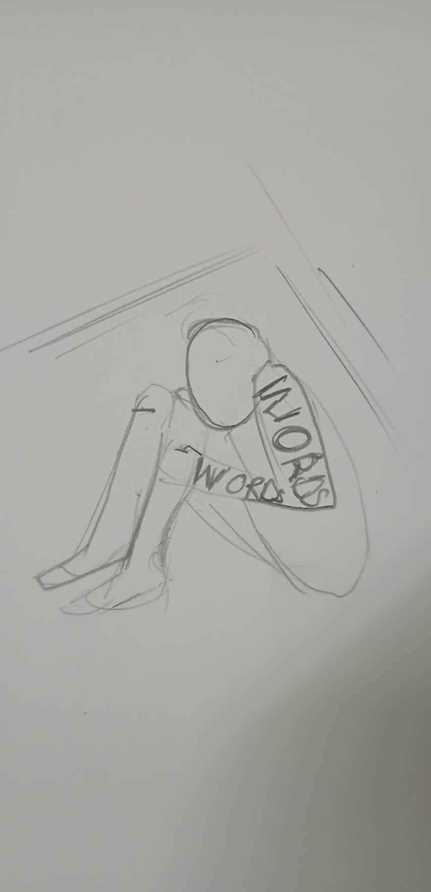
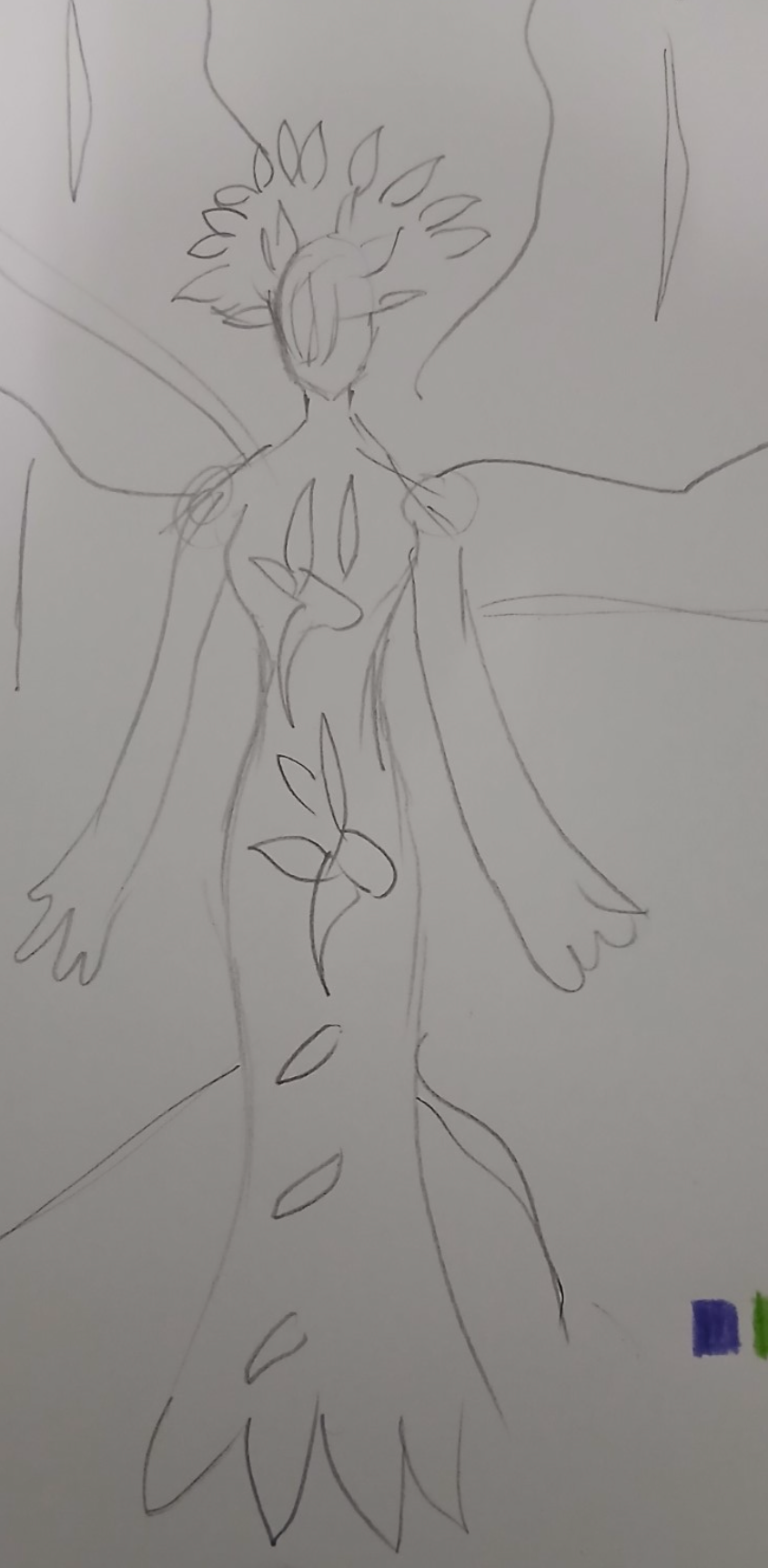
Image of the process, Sketches. Courtesy of the designer Byron Basson. CUT, SA, 2026